Branding
A logo should not only be highly visual, recognizable, and capable of evoking emotion, but it should also possess the advantage of not being a literal representation of your product or service. The beauty of a graphic icon lies in its ability to carry significant visual weight. Your logo should ideally be simple enough for clients to remember it even after just a quick glance, whether online or offline.
Stunt Pilot™: Branding
This is one of my favorite logotypes I’ve designed. It’s extremely simple, the lettering is not stylized or altered but the magic comes with its orientation being upside down, which is a common form while flying FPV drones, as the drone does tricks and hangs upside down a lot.
Also, it was the first time I actually liked having the trademark “™” symbol at the end of the logotype because instead of throwing the visual weight off balance, it actually assures the viewer that the logo is meant to be upside down and its not a mistake. The yellow and black color choice is reminiscent of caution tape, to add to the stunt pilot theme.
My client Tommy Tibajia aka Ummagawd FPV is one of the most prolific drone pilots and OGs in FPV, and one of my favorites since day 1 so I was super excited and honored to have a chance to create something very special for him.
Veero: Brand Identity / Brand Guidelines
Veero offers a cutting-edge technology-driven approach to sizing your face for glasses. By leveraging the app, users can precisely determine their pupillary distance without the necessity of an in-person optometrist appointment.
To craft a distinctive logo that strikes the balance between memorability and subtlety, I drew inspiration from the design of an ophthalmoscope and the distinctive shape of the lenses, resembling an inverted “V”.
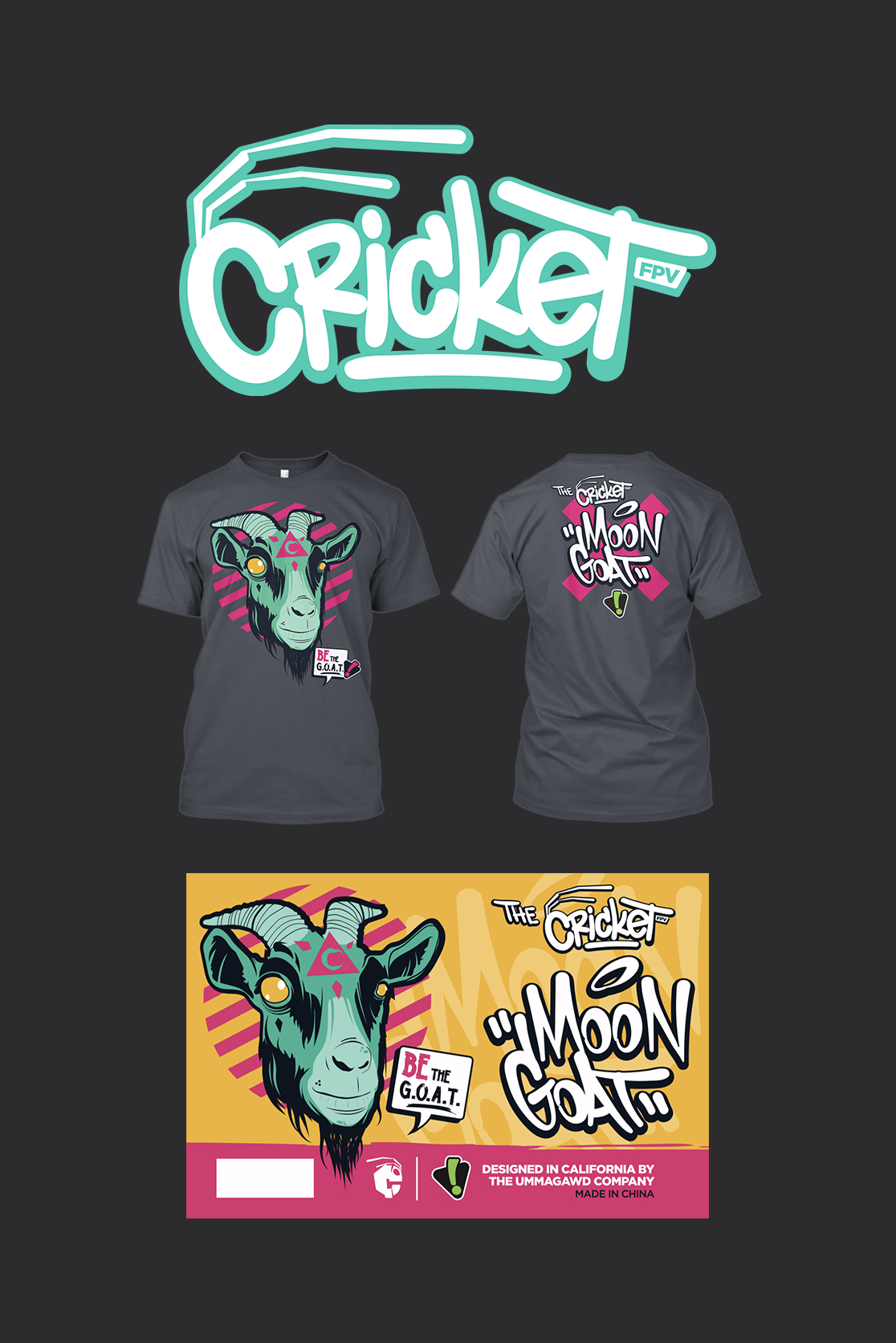
Cricket & Moon Goat: Branding
Cricket is known for his unique FPV flying freestyle and he came to me to redesign his logo. The logo he had created before was too cartoony (it was a cartoon cricket 🙄, way too literal for my taste) but there’s no way to get that level of detail onto a tiny drone motor. He came to me because he knows I keep it funky while making sure the logo will work for any application and is of the highest quality. He also wanted for me to brand his new drone frame, the “Moon Goat” and he gave me full creative control. My favorite.
I created the “Cricket” lettering in Illustrator, I avoid using fonts if I don’t have to, especially for graffiti styled lettering, I have never used any graffiti font ever in my 24 years of designing, I find it sacrilegious. I also wanted to portray a cricket at first glance and I think the antennae was perfect, as the “C” makes a perfect head for them.
I illustrated the goat from a reference image I found online and then added the pink forehead tattoo with a moon in it to tie it all in and add some mysticism. I created the “Moon Goat” lettering in Illustrator and kept the overall theme fun, rebellious, weird and interesting.
Rotor Riot / Rampage: Logo Design
Rotor Riot Rampage stands out as the biggest FPV drone event globally. I was asked to craft the event's emblem, showcasing the iconic Rotor Riot skull pilot at the center amidst a grandiose design that imbues it with a touch of prestige akin to a distinguished tech accolade seal. With a thriving history spanning four years, the event logo has seamlessly evolved in parallel. https://rampage.rotorriot.com/
Elev8: Logo Design
Elev8 is not only a popular sneaker head shop in Baltimore, but also an FPV drone team. Commissioned to craft a logo that exudes a sense of boldness, simplicity, and futuristic vibes, I tackled this design challenge.
Opting for a font that resonated with the vision, I dove deep into customization using Illustrator, ensuring every detail aligned harmoniously. Elevating the number 8 above the rest of the text symbolized the essence of 'elevate,' while strategically shaping it to blend seamlessly with the adjacent 'V.' The end result was a versatile logo that effortlessly transitioned between representing the team and represented the store's aesthetic.
StingersSwarm: Logo Design
I was honored to have the opportunity to design a new logo for Stingersswarm. As one of the original FPV pilots, his presence on YouTube has been nothing short of inspiring over the years. With the goal of crafting a logo that embodies timelessness, simplicity, and memorability, I embarked on this creative journey. The resulting design is not just a symbol but a representation of his passion - one that can seamlessly adorn his YouTube channel, merch, or even be etched onto a drone motor, a testament to the precision and simplicity in its execution.
The logo captures the essence of motion with its distinct spinning elements reflecting propeller movement, while the incorporation of up and down arrows symbolizes vertical prowess in flight. Moreover, when viewed from a different perspective, the central design cunningly reveals the letter "S", adding an extra layer of personalization and significance.
Hardly Normal Podcast: Brand Identity
The Hardly Normal Podcast is weird, funny and full of love vibes, so I started with a friendly, quirky, almost hand-crafted font that represents the brand well and would translate well online as well as with merch and can coexist well with the heart.
The album imagery on the top right was created using AI and I think the artificial “AI look” actually works well to add a dream-like surreal feel to it.


